
Lesson 8
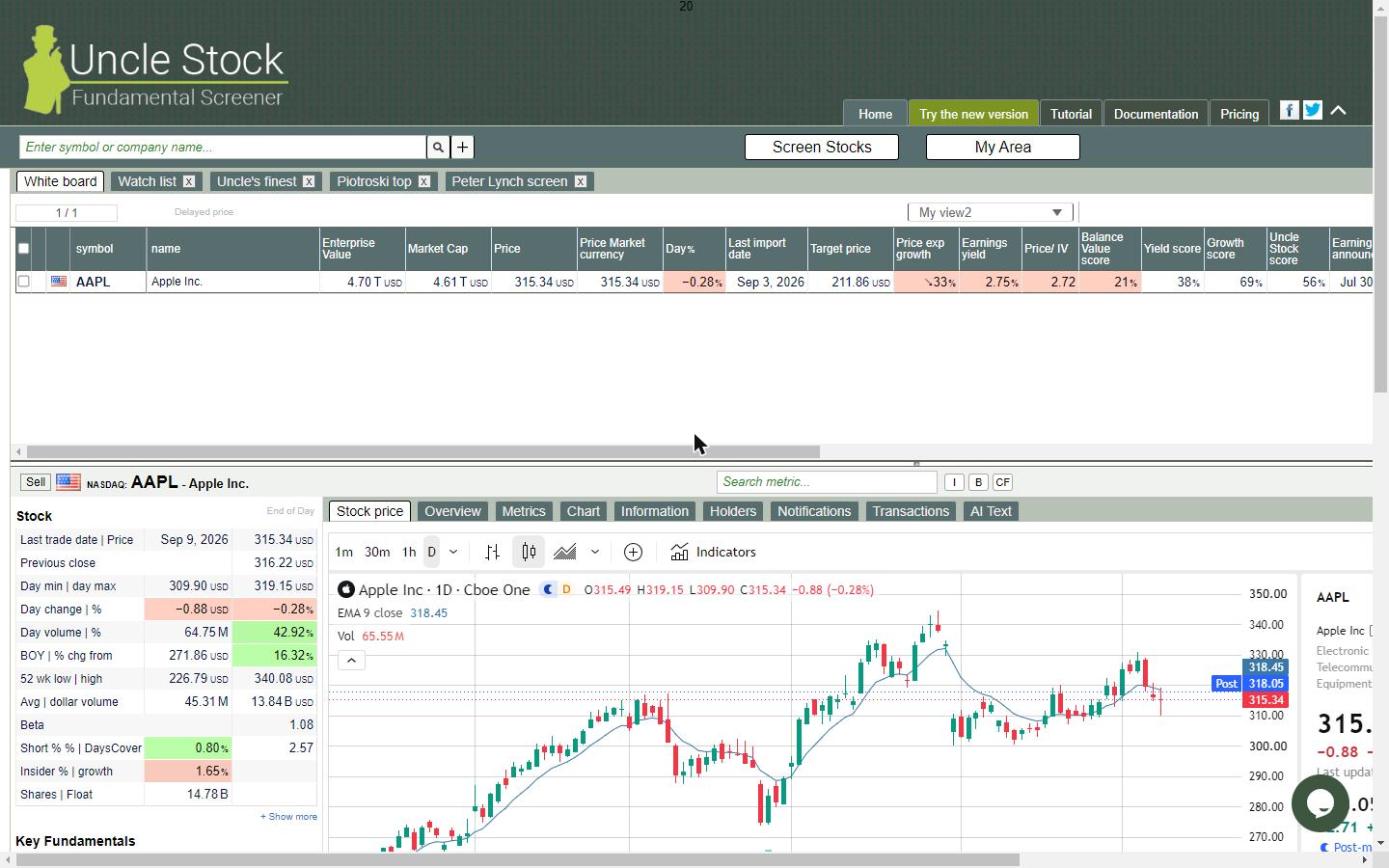
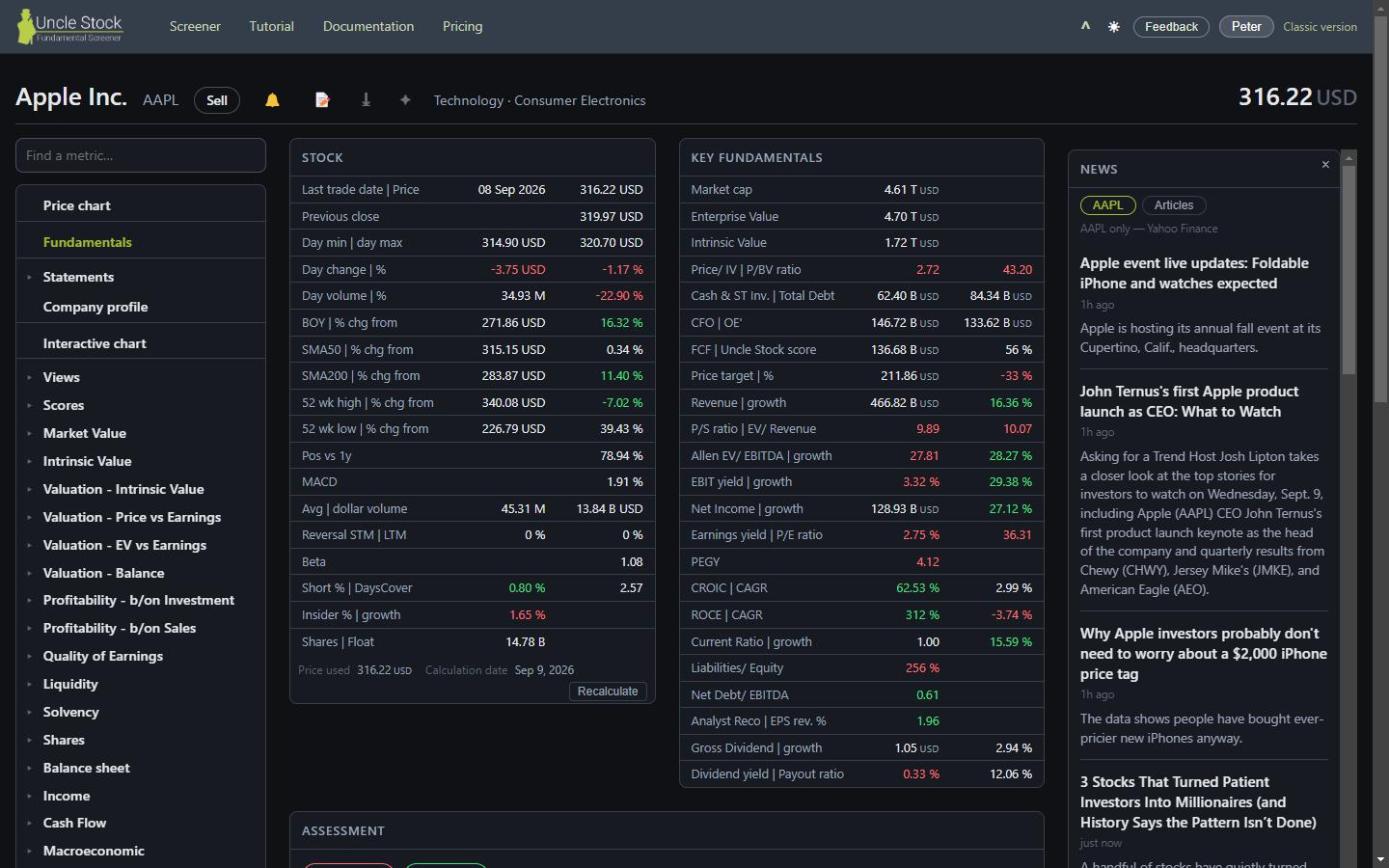
Coming from the classic client
Everything you knew is still here. Most of it has moved, some of it has a different name, and a few things have not made the trip yet. This page is the map.
Both clients read the same account. Your stock lists, saved screens, column sets, hidden metrics, positions and alerts are the same in either one, and a change in one shows up in the other. You can move back and forth as often as you like.
1Where everything went
| In the classic client | In the new interface |
|---|---|
| Look Up and the White board | The same search box, and the White board tab. Unchanged. |
| My Area | Split in two: My lists for stock lists, Screens… for queries. |
| Screen Stocks | ⚙ Screen stocks, in the same toolbar. |
| The query dialog | The same dialog: universe on the left, sort and conditions on the right. |
| The tabs under a company | The menu down the left side of the detail. |
| Fundamental details | Fundamentals, with the metric groups underneath it. |
| AI Text tab | Copy for AI, an icon in the company header. |
| Notifications tab | The 🔔 in the company header. |
| Transactions tab | The My position card, under the Price chart. |
| Cash position, with the transactions | The account menu. It is one setting for your whole portfolio, not one per company. |
| Holders tab | Company profile → Ownership. |
| Reimport | Company profile, under the import date. |
| Clear cache | Recalculate, next to the price it recomputes against. |
| Views | The same picker, with ✎ beside it to build your own. |
| Hide metrics | The account menu. Same setting, shared by both clients. |
Language in the address (/nl, /de) | The account menu. English, Dutch, German and Spanish. |
| Piotroski top and Uncle's finest as fixed tabs | Gone as tabs. Both are in Screens…, with every other ready-made screen. |
2Finding a metric under the name you know
This is the one that trips people up. A metric's short label in a table is not always the name you have in your head, and the search box is how you bridge that. It ignores punctuation, ignores filler words like “to” and “of”, and also looks at each metric's full name, not only its label.
So the reliable habit is: spell it out in words.
| Type this | And you get |
|---|---|
price to earnings ratio | Price/ Earnings |
debt to equity | Total Debt/ Equity, and the tangible-equity variants |
return on equity | ROE, plus ROTE and Cash ROE |
free cash flow yield | FCF yield |
g-score | Mohanram G-score, among the other scores |
mohanram | Mohanram G-score — the person's name works too |
Short abbreviations are the weak spot. Typing p/e or pe ratio
does not currently bring up the price-earnings metric — you get PEG, Sharpe
ratio and other things that merely contain those letters. Type
price to earnings ratio instead, and it comes up on its own.
3What the new interface adds
- A light and a dark theme, following your system unless you choose.
- Each list remembers its own column set, instead of one set for everything.
- Refining a screen offers Update and Save as new as two separate buttons, so a tweak can never silently overwrite the original.
- Ctrl+↑ and Ctrl+↓ step through a result list without the mouse, and Ctrl+← and Ctrl+→ go back and forward between the metrics you opened.
- A colour-blind-friendly palette, and shapes as well as colours on the buy/sell markers.
- Every screen has its own address, so you can bookmark or send a link to exactly what you are looking at.
- A layout that genuinely works on a phone.
- Any row of a metric's table can be drawn in the chart above it — its one-year growth, its five-year average, its difference against the industry — where the classic client only ever charted the metric itself. See lesson 4.
- Ranking on several metrics at once Silver is in the builder, so refining or saving such a screen keeps every criterion — see lesson 5.
4What the classic client still does that this one does not
Four things have not moved across yet. If you rely on one of them, use the classic client for it.
| Not here yet | Where it is in the classic client |
|---|---|
| Simulate Gold Fill in your own metric values and see what it does to the scores. |
The menu at the right of the company header. |
| Export to HTML Gold A full report for one company as a web page. |
The same menu. The csv export is available in the new interface. |
| Gainers, losers and signals Silver The day's movers, per exchange. |
The My Area menu. |
| Opening a company's peers in one click The other companies in its industry or index. |
The link beside the industry name in the company header. The new interface can show those lists, but has no button on the company that takes you there. |
Two things that are gone on purpose
The overview's separate Income, Cash flow and Profitability panels are not missing — everything they showed is in Key fundamentals, with the reported figures under Statements. And the csv export drops the classic “metrics from view” option, which did not work there either.
5Going back, and coming back
Classic version sits in the top right of every screen. Use it whenever you need one of the four things above, and come back when you are done — there is nothing to migrate in either direction.
Tell us. The Feedback button in the header goes straight to the people building it, and it carries the screen you were on. Most of what has been fixed in the new interface came in that way.