
Lesson 4
Dig into a metric
By the end of this lesson you can find any of Uncle Stock's metrics by the name you know it by, read its history year by year, and see the exact calculation behind any number on the screen — right down to the figures that came out of the filings.
This is the part of Uncle Stock that other screeners do not have. Anywhere else, a ratio is a number you either trust or you do not. Here every number opens: the formula that produced it, the values that went into it, where those values were imported from, and what the same metric did in the ten years before. It is worth twenty minutes.
Open a stock and follow along1Find the metric
There are two ways in, and you will end up using both.
-
Type what you know. The box at the top of the left menu reads Find a metric…. Start typing and Uncle Stock offers matches as you go.
You do not have to type it our way. Punctuation is ignored, so
g-scoreandg scoreare the same search. Filler words are ignored, so price to earnings ratio finds the metric even though it is called Price-Earnings Ratio. And a metric is findable by the name it is known by, not only by the short label it wears in a table. -
Or walk the tree. Below the box the metrics are grouped — valuation, efficiency, liquidity, solvency, scores, the three statements, and the rest. Open a group to see what is in it. This is the way to use when you are not looking for something in particular but want to know what is on offer.
-
Or click a number. Any value in a stock list or on a company page is a link to its own metric. This is usually the fastest route: you were already looking at the figure that made you curious.
A search matches on every word you type, so more words narrow rather than widen. If nothing comes back, drop a word rather than rephrasing the whole thing.
2Read the table
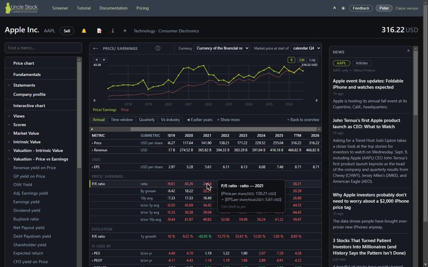
A metric opens as a table. Its dimensions are the rows — the value itself, its growth, its five-year average, and so on — and the years are the columns, oldest on the left. It opens scrolled to the recent years, because that is what you came for.
 1
2
3
4
5
6
7
8
1
2
3
4
5
6
7
8
- The metric search box
- The metric tree, grouped
- The five views of this metric
- ◀ Earlier years
- Dimensions, one per row
- One column per fiscal year
- The Latest column
- The calculation, on hover
The Latest column is not always the last twelve months
For something a company earns over a period — revenue, profit, cash flow — Latest means the trailing twelve months. For something it simply has at a moment — cash, debt, equity — there is no such thing as a twelve-month total, so the column reads Recent and holds the most recent reading. Uncle Stock decides this per metric; you do not have to.
Two buttons that widen the table
- ◀ Earlier years computes and adds the years before the window you are looking at. They are not there from the start because computing them costs time you usually do not want to spend.
- + Show more adds the less common dimensions of this metric. − Show less takes them away again, and the table gets faster.
The first metric you open on a company can take a few seconds — Uncle Stock is computing that company's whole history, not just this one row. Every metric you open afterwards is quick. If you plan to study a stock properly, open anything on it first and let it warm up while you read.
3Hover any number for its calculation
This is the heart of it. Put your mouse on a value and Uncle Stock shows you how that value was produced: the formula, and the numbers that went into the formula.
For a historical cell, that explanation is not re-derived for you — it is the trace that was recorded when the value was computed. You are reading what actually happened, not a plausible reconstruction of it. And when a cell is empty, the same tooltip tells you why it is empty: a missing input, a period that cannot be derived, a denominator that was zero.
The columns Uncle Stock screens on — the latest and trailing values — behave a little differently. Hovering one of those runs the calculation again, fresh, ignoring the cache. If the fresh result differs from what the cell shows, you see both. That difference is usually the sign that a company reported something new since the last computation.
Hold Ctrl+Shift as your mouse leaves the cell and the tooltip stays on screen, so you can select the numbers in it or compare two of them side by side.
4Five views of the same metric
Above the table sits a row of buttons. They are five ways of looking at one metric, and each answers a different question.
| View | The question it answers |
|---|---|
| Annual | How has this developed over the years? The default, and the one to use for trends. |
| Time window | What do the moving twelve-month windows say — trailing (the last four quarters), rolling (two behind and two ahead), and forward (the next four quarters, on analyst expectations)? |
| Quarterly | What did the individual quarters do? Only offered for metrics that have quarterly values at all. |
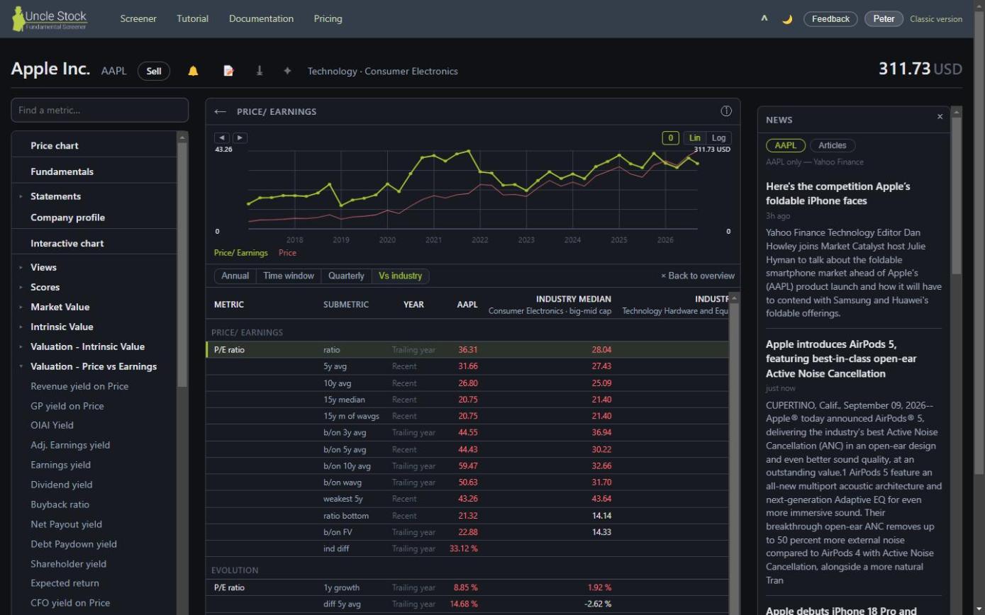
| Vs industry Gold | Is this number good for this kind of company? Puts the stock's value next to the median of its industry and of its wider industry group. |
| Source data | What did the data sources actually deliver, before any calculation or extrapolation? Only appears when there is imported data behind the metric. |
Vs industry Gold
A price-to-earnings of 22 means one thing for a utility and another for a software company. This view answers that by comparing against the companies Uncle Stock considers comparable — same industry, and same size bracket — using the median rather than the average, so a single extreme company cannot move the bar.
Without a Gold pack the medians are hidden, but the view still opens and still shows you the stock's own values.
Source data
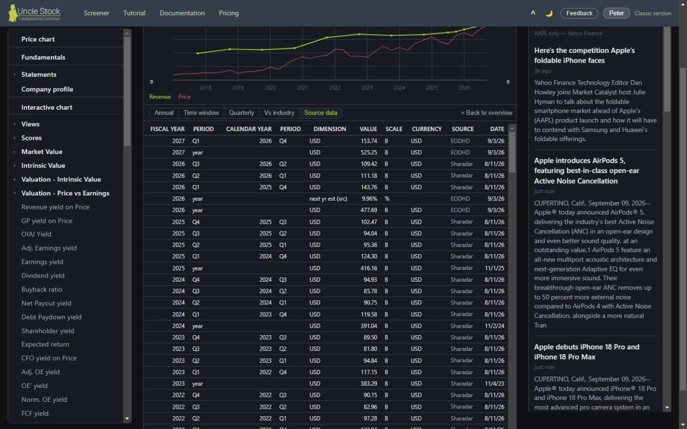
The rest of Uncle Stock shows you computed figures. This view shows you the raw imported ones, newest first, exactly as they arrived. It is the window on data quality: if a ratio looks wrong, this is where you find out whether the calculation is at fault or the filing behind it.
Some metrics have no source data at all, because nothing about them is imported — they are calculated from other metrics from end to end. Uncle Stock says so rather than showing you an empty table.
5Fiscal years and calendar years
Company years do not line up. One closes its books in December, the next in June, and comparing them column by column would put unrelated periods side by side.
Uncle Stock's rule: a fiscal year is filed under the calendar year in which most of it was earned. So a fiscal year ending in the first quarter of a calendar year counts under the year before, because that is when nearly all of the work happened. It is the only way a screen can compare two companies fairly, and it is what keeps a backtest from buying on figures that did not exist yet.
In the Quarterly view you can switch the headers between fiscal and calendar periods with Use calendar periods. This relabels the columns only — the values do not change.
6The chart above the table
Above the numbers, the metric is drawn against the share price. Two things about it are worth knowing:
- The scale starts at zero. That is deliberate. An axis that fits itself to the data makes a metric that wobbled by one percent look as dramatic as one that halved. With zero on the axis, the height of the line means something absolute, and a real outlier is the only thing that moves it.
- You choose which row is drawn — see below. A lin / log switch sits beside the chart for the metrics that span orders of magnitude.
Plot any row of the table
A metric is more than one series. Under its name the table lists its own submetrics — the one-year growth, the five-year average, the difference against the industry — and clicking one of those rows draws it in the chart in place of the metric itself. That is how you see the shape of a thing the plain line hides: revenue rising every year looks the same whether it grows by 2 % or by 20 %, and Revenue · 1y growth is the row that shows the cycle.
A line under the chart names what is drawn, with an × to go back to the metric. Only the rows of this metric plot: the price and revenue rows at the top, and everything under Uses, Is used by and Is related to, belong to other metrics, so clicking those opens the metric instead. Hover a row name and the panel says so when the row plots.
7Follow the calculation up and down
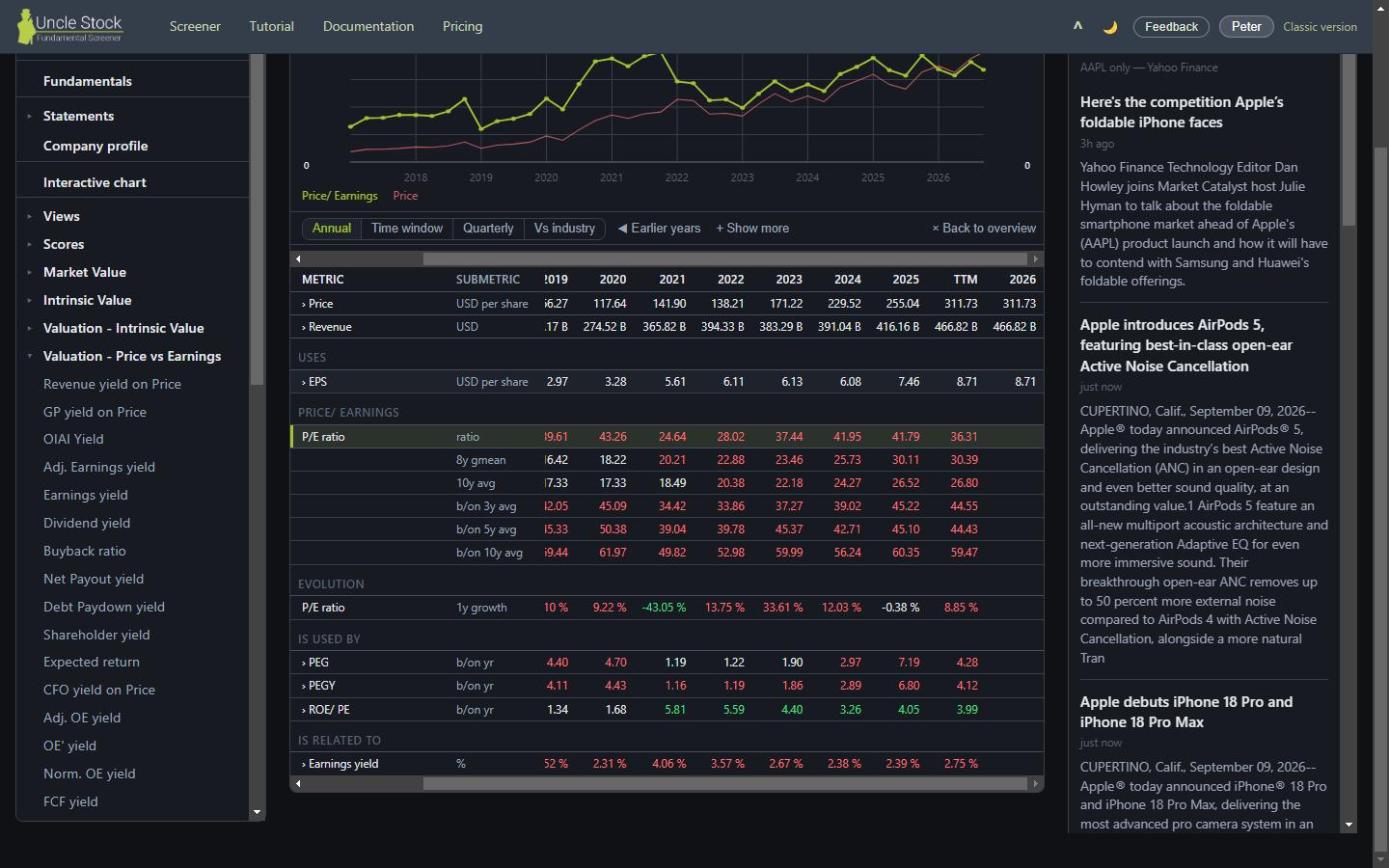
Under the table, Uncle Stock lists what this metric is built from, what is built on top of it, and what else is related to it. Each is a link.
That turns a score into something you can audit. Start at the Uncle Stock score, step down into the ratios it weighs, step down again into the line items those ratios divide, and you end up at figures that came straight out of a filing — without ever leaving the panel. When a score surprises you, this is the path that explains it.
8Money in the currency you think in
The Currency selector converts every money value on the page. Its first two options are not currencies but rules: Stock price currency follows the market the share trades on, and Currency of the financial results follows the books the company keeps. Below them is the list of currencies, if you would rather see everything in one.
The choice is remembered and it holds across the whole app. Share prices are the exception: they always stay in the currency they are quoted in, because a quote in another currency is not a quote.
9Fewer metrics, less noise
Uncle Stock carries several hundred metrics. If most of them are not yours, hide them: open the account menu and choose Hide metrics…. Untick what you never use, and it disappears from the tree, from the search box and from every metric picker in the app. Basic view does a broad pass of the same thing in one click.
The setting lives on your account rather than in your browser, so it holds on your other devices — and in the classic client too.
You can now read any single number Uncle Stock prints. The next lesson turns that around: instead of asking what one company's figures are, you ask the whole market which companies have figures like these.